Dream Wash
Designing a simpler on-demand laundry experience from 3-tap booking to doorstep delivery.
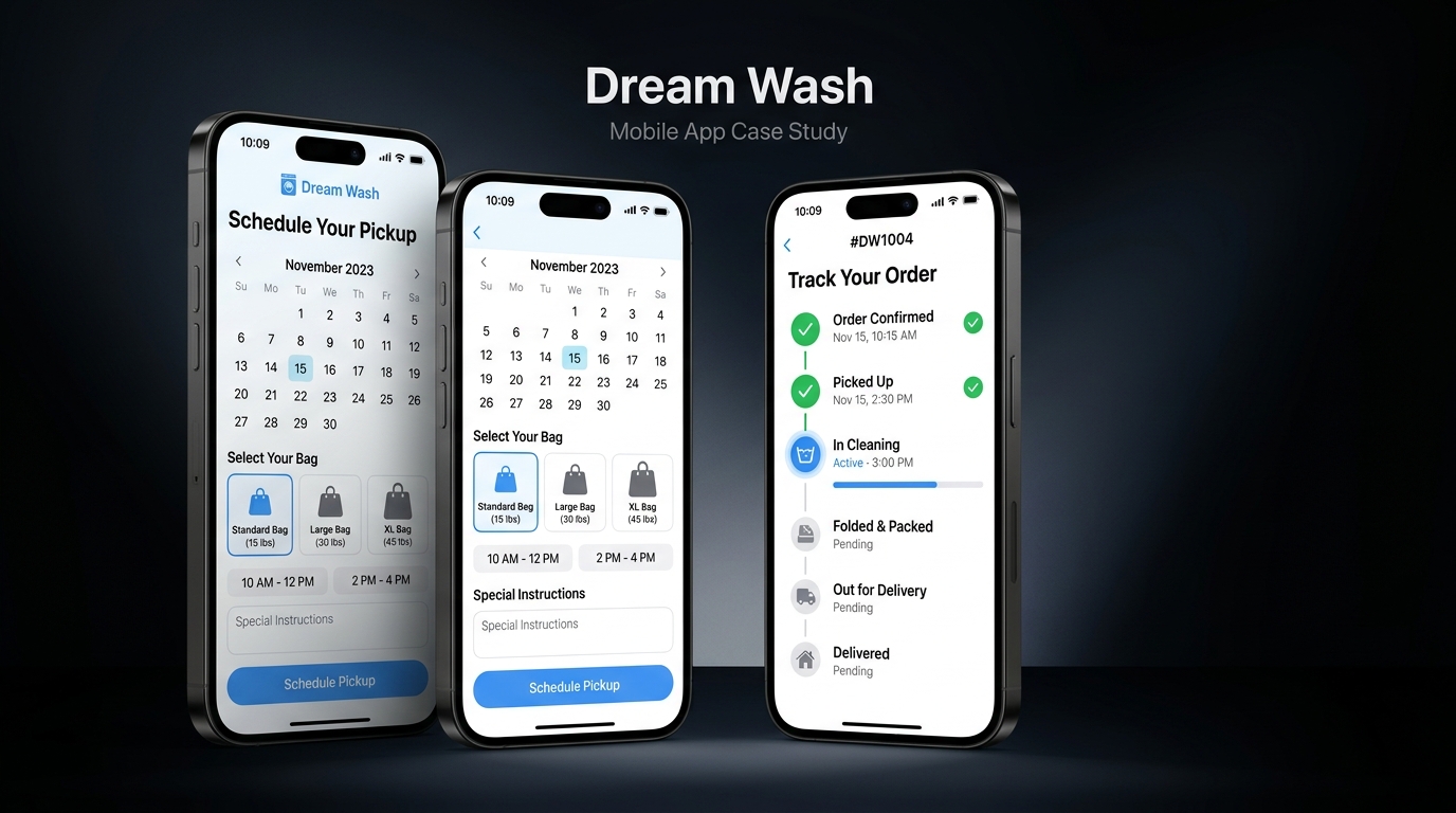
What is Dream Wash?
Dream Wash is an on-demand mobile laundry experience designed to make booking, scheduling, and garment tracking effortless. The project focuses on eliminating service friction, reducing decision fatigue during booking, and providing real-time status visibility for busy urban residents.
As the Product Designer, I mapped the end-to-end service journey, designed the mobile interface system, and created interactive prototypes to validate the 3-tap booking flow.
My Personal Responsibilities
What Makes Laundry Services Frustrating
Laundry is a recurring chore that users want to complete as fast as possible. Existing services introduce unnecessary friction at every step:
Manual & Unpredictable Booking
Traditional services require phone calls or text messaging without clear pickup windows, creating scheduling conflicts.
Zero Status Visibility
Once clothes are handed over, users have no idea whether they are in washing, drying, or delivery transit — causing anxiety.
Itemized Pricing Fatigue
Counting individual shirts, trousers, and socks before booking creates heavy cognitive load and unexpected bill totals.
Who We Designed For
Primary Target User
- Working professionals & university students
- Living in apartments, hostels, or shared PG accommodations
- Time-poor — wants laundry handled with zero management overhead
- On-demand native — expects Uber/Zepto-like simplicity
User Needs & Jobs-to-be-Done
- Book a pickup in under 60 seconds
- Select a convenient 2-hour pickup window
- Track garment progress without calling support
- Receive clean, folded clothes directly at the door
Service Context Analysis
Analyzed current laundry booking patterns and service journey friction points to identify where digital interface decisions could simplify physical operations.
Garment Estimation Friction
Identified that asking users to count individual clothing items is the #1 drop-off point in laundry booking apps.
Status Anxiety Window
Mapped customer calls to laundry providers and found 80% of inquiries were simply asking "When will my clothes arrive?"
Time Slot Preference
Found users prefer broad 2-hour pickup windows (e.g. 8 AM - 10 AM) over exact timestamps.
3 Key Friction Points
Complex Bag Counting
Itemizing every shirt, pair of pants, and towel creates heavy decision fatigue before the user can even book.
Uncertain Pickup Slots
Vague promises like "someone will come today" force users to stay home waiting for an agent.
Black-Hole Processing
Zero visibility into whether clothes are being washed, dried, or folded creates constant uncertainty.
Structuring the Mobile Experience
Mapped out a streamlined 4-step mobile hierarchy to eliminate unnecessary navigation depth:
Primary Mobile Journey
I simplified the primary journey by reducing unnecessary decisions and making the next action clear at each stage:
Design Evolution & Screen Structure
Iterated through screen layouts to test bag visualizers and status stepper components before high-fidelity visual design.
Bag Capacity Cards
Replaced text lists with visual bag cards specifying estimated clothing item limits (e.g. Standard = ~15 items / 1 bag).
Horizontal Time Slot Selector
Designed a clean horizontal scroll selector for 2-hour pickup slots (e.g. 8 AM – 10 AM) for instant tapping.
Milestone Stepper Tracker
Created a vertical progress stepper (Picked Up → In Wash → Drying → Delivery) to give users immediate feedback.
Design System & Tokens
I created a reusable component system to maintain consistency across the product and make future screens faster to design and build:
Typography & Color Tokens
Clean Royal Blue (#2563EB) & Sky Blue (#3B82F6) palette associated with freshness and trust. Dark Slate (#1E293B) for crisp text contrast.
Component Library
High-Fidelity Interface Screens
Fresh, scannable mobile UI featuring bag selection cards, live order tracking, and delivery confirmation.
Key UX Decisions & Rationale
Bag-Based Pricing over Itemized Garment Counts
Why: Asking users to itemize shirts, socks, and sheets creates decision fatigue. Standard bag sizes (Standard, Large, XL) reduce booking time to under 60 seconds.
2-Hour Horizontal Pickup Windows
Why: Exact timestamps cause agent delays and user frustration. 2-hour windows (8 AM – 10 AM) provide operational flexibility while giving users predictability.
Live Status Stepper on Active Order Screen
Why: Visual progress steppers (Washing → Drying → Delivery) reduce customer support calls by giving users instant status visibility.
Interactive Flow Validation
Created an interactive Figma prototype demonstrating the complete mobile booking journey: selecting bag size → picking time slot → confirming order → viewing live status tracker.
From Figma to Functional Product
I used AI-assisted development to translate the designed experience into functional frontend components and iterate directly between design and implementation.
Vibe Coding in Practice
Instead of treating development as a separate handoff, I used AI-assisted development to move from design decisions to working UI, allowing me to test interactions and refine the experience faster.
- ✦ Translated bag selection card specs into responsive flexbox components.
- ✦ Built status stepper components with active state highlighting.
- ✦ Refined touch target padding for mobile interaction.
Project Results
3-Tap Booking Model: Successfully designed a mobile flow that enables booking in under 60 seconds without complex item counts.
Status Transparency: Designed a clear status stepper that eliminates order tracking anxiety.
Consistent Mobile Design System: Created a clean color, typography, and card component library for laundry service apps.
What I Learned
01 — Reducing decision fatigue is a design superpower. Eliminating unnecessary choices makes products feel significantly faster and smarter.
02 — Status visibility reduces anxiety better than speed. Users don't just want fast service — they want to know where their order is.
03 — Service design shapes interface design. Understanding offline pickup operations directly informed the 2-hour time slot UI.