Outvox Solution
From business idea to designed, developed and deployed digital product.
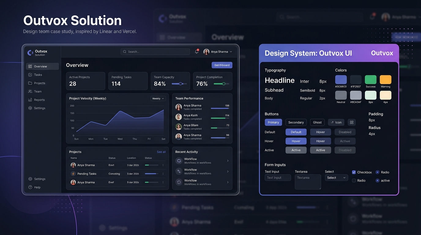
What is Outvox Solution?
Outvox Solution is a B2B corporate digital platform offering premium telecalling, customer support, and digital services. The business required a modern, authoritative web platform to present its service offerings, build immediate trust with organizational clients, and generate direct sales inquiry conversions.
As the Product Designer & Developer, I owned the entire product lifecycle — translating raw business requirements into information architecture, designing the complete component system in Figma, vibe-coding the frontend with AI-assisted development, and shipping the working platform to production.
My Personal Contributions
The Challenge: Building B2B Trust From Zero
Outvox Solution needed a platform that could compete visually with established agencies while converting cold B2B traffic into high-intent client inquiries.
No Digital Credibility Layer
Operating without a dedicated web platform meant prospective clients had no way to verify service capability or company legitimacy before initiating calls.
Complex Multi-Service Communication
Combining BPO telecalling with web design and digital operations required structured content framing so visitors wouldn't feel confused by service overlap.
Conversion Friction
Without a structured funnel, potential clients left the site without submitting requirements or scheduling consultation calls.
Who We Designed & Built For
Primary Target Audience
- B2B business owners, founders, & department heads
- Operations managers looking to outsource customer support/sales
- Growing companies seeking fast-turnaround web development
Stakeholder Requirements
- High-converting hero value proposition
- Clear breakdown of services with individual cards
- Direct WhatsApp and email lead conversion paths
- Mobile-first responsive performance across all screens
Product Strategy & Requirement Analysis
Mapped out the business requirements and evaluated competitor agency platforms to determine what structural elements drive confidence in B2B service purchasing.
Requirement Mapping
Worked directly with business leads to extract core service offerings, pricing tier models, and target customer profiles.
Market Benchmarking
Analyzed top-tier digital agency and BPO web platforms to identify design patterns that signal technical authority and scale.
Content Architecture Strategy
Decided on a single-page scrolling structure with sticky navigation to allow instant access to service details and contact forms.
3 Key B2B Experience Gaps Solved
Lack of Visual Authority
Generic, low-quality templates fail to convince corporate clients that an agency can handle mission-critical telecalling or web builds.
Information Overload
Text-heavy paragraphs obscure what the business actually does. B2B decision makers need scannable, outcome-focused feature cards.
High-Friction Contact Forms
Long contact forms with 10+ required fields cause high bounce rates. Decision makers prefer quick 2-field inquiry options or direct instant chat.
Site Architecture & Section Hierarchy
Designed a logical top-to-bottom section hierarchy that moves a visitor from initial awareness to trust and final inquiry:
Primary Conversion Flow
I simplified the primary journey by reducing unnecessary decisions and making the next action clear at each stage:
Design Evolution: Idea → Figma Wireframes
Mapped out the structural grid in Figma before building the visual system. Key wireframing decisions:
Bento-Style Service Grid
Organized core offerings into a scannable Bento grid layout, separating Telecalling, BPO, and Web Development into clear visual buckets.
Glassmorphism Surface Cards
Designed semi-transparent card panels with subtle 1px glowing borders to create a premium, modern aesthetic without clutter.
Persistent Navigation Header
Built a blur-backed glass navbar that shrinks on scroll, maintaining logo visibility and instant access to the "Contact Us" CTA button.
Exact Live Design System & Color Tokens
I created a reusable component system in Figma and extracted the exact token variables directly into CSS to maintain 100% fidelity between design and live production code:
Live Design Tokens
Obsidian dark background (#03000A), dark violet surface (#0A0616), royal purple accent (#9976CF) and deep purple surface accent (#220F3D). Manrope for headings & Inter for body text.
Component Library Tokens
Live Production Application
Live production interface of outvoxsolution.com showing dark obsidian theme, purple glow accents, and responsive layout.
Key UX/UI Decisions & Technical Rationale
Obsidian & Royal Purple Dark Theme
Why: Dark obsidian backgrounds (#03000A) paired with purple radial glow accents (#9976CF) create a high-tech, authoritative aesthetic that stands out from generic light agency templates.
Bento Grid Service Breakdown
Why: Placing service offerings into distinct glassmorphic panels lets corporate decision makers digest Telecalling, BPO, and Web Development capabilities at a glance without reading walls of text.
Multi-Channel Low-Friction Lead CTAs
Why: Provided both direct form submission and a persistent floating WhatsApp action button — catering to clients who want fast chat communication vs formal proposal requests.
Interactive Web Application
Instead of relying only on static Figma screens, the complete product was vibe-coded into a live, interactive web application with micro-animations, theme gradients, and responsive navigation.
From Figma to Functional Product
I didn't stop at the design handoff. I designed the experience, translated it into code with AI-assisted development, and shipped the working product to production.
Vibe Coding in Practice
Instead of treating development as a separate handoff, I used AI-assisted development to move from design decisions to working UI, allowing me to test interactions and refine the experience faster.
- ✦ Exported Figma token variables (`--bg-color`, `--primary`, `--glass-bg`) directly into production CSS.
- ✦ Prompted AI assistants (Cursor) to build modular React components for hero section, pricing cards, and footer.
- ✦ Tested responsive layout behavior directly in the browser, fixing padding and font scaling issues instantly.
- ✦ Deployed to Vercel production host with continuous iteration as design updates were made.
Project Results & Shipped Deliverables
Live Shipped Product: Successfully built and deployed outvoxsolution.com to production, establishing an authoritative digital presence for the business.
Zero Design Handoff Loss: Owning both design and frontend code ensured 100% fidelity between Figma component tokens and production CSS.
Rapid Product Delivery: Used AI-assisted development to cut initial build time by over 60% compared to traditional design-to-dev handoff pipelines.
What I Learned
01 — Product decisions matter more than visual polish. Structuring service cards and CTA accessibility provided far more business value than simple visual animations.
02 — Designing with implementation constraints creates better solutions. Knowing how CSS custom properties and React layout components work made my Figma component systems significantly cleaner.
03 — AI-assisted development changes how quickly design ideas can be tested. Moving from Figma spec to browser preview in minutes allows instant usability iteration.