Find My PG
Simplifying the search for PG accommodation for students and young professionals.
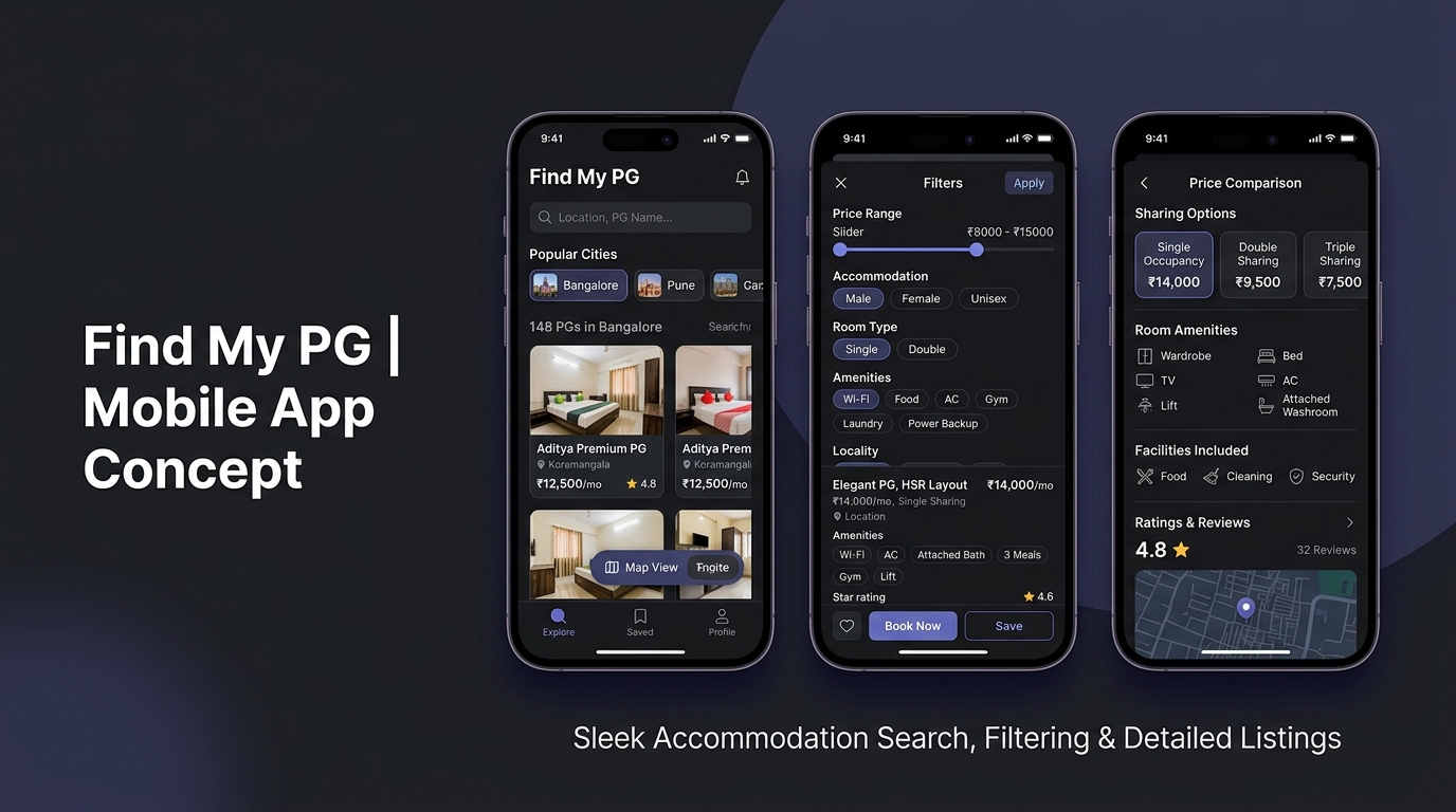
What is Find My PG?
Find My PG is a mobile-first accommodation discovery platform designed for students and young professionals relocating to new cities. The core objective was to eliminate the fragmented, high-friction experience of searching for paying-guest (PG) accommodation across scattered WhatsApp groups, broker calls, and unverified physical listings.
As the Product Designer, I owned the full UX lifecycle — from understanding user friction and mapping information architecture to creating high-fidelity interface systems and interactive Figma prototypes.
My Personal Responsibilities
What Users Struggled With
Relocating to a new city for college or work is stressful. Searching for accommodation makes it worse because current channels are informal, unorganized, and lack basic transparency.
Fragmented Discovery Channels
Searches happen across WhatsApp groups, Telegram chats, Facebook posts, and broker calls — creating a chaotic experience with zero central record.
Hidden Costs & Opaque Specs
Listings routinely hide maintenance fees, food inclusion rules, deposit policies, and sharing configurations until users visit in person.
No Way to Compare Options
Users must track properties across random notes apps and chat screenshots, making side-by-side comparison almost impossible.
Who We Designed For
Primary Target User
- Students & early-career professionals (aged 18–26)
- Relocating to major IT hubs or college clusters
- Time-pressured — needs a verified place within 7–14 days
- Mobile-native — relies entirely on smartphone apps
User Needs & Expectations
- Exact walking distance to transport & office/college
- Upfront rent + deposit + notice period breakdown
- Direct, in-app manager callback request
- Clear photos of room, washroom, and dining amenities
How the Problem Was Analyzed
Rather than relying on generic assumptions, the problem was analyzed by evaluating current accommodation discovery channels, analyzing existing market products, and mapping direct student relocation behavior.
Channel Audit
Analyzed WhatsApp accommodation groups and broker listings to identify the most frequently asked questions and repeated breakdown points.
Competitor Heuristic Evaluation
Evaluated rental platforms to understand why young migrants find general real estate apps overwhelming for PG searches.
Decision Barrier Identification
Identified that missing pricing breakdowns (deposit, food inclusion, electricity rules) were the #1 reason users hesitated to contact managers.
3 Friction Points Identified
Fragmented Search Noise
Brokers spam irrelevant properties without location or budget filters, forcing users to manually sift through hundreds of chat messages.
Pricing Uncertainty
Single, double, and triple sharing rates are rarely listed clearly. Deposit rules and maintenance charges are revealed late in the journey.
Lack of Trust & Verification
Low-quality, outdated photos and unresponsive managers make users anxious about committing money or travelling for visits.
Structuring the Mobile Product
Organized the app structure to ensure any user could move from location input to verified contact in 4 steps maximum:
Frictionless Primary Journey
I simplified the primary journey by reducing unnecessary decisions and making the next action clear at each stage:
Design Evolution: Structure Before Style
Low-fidelity wireframing focused on layout hierarchy, thumbnail sizing, and sticky action buttons before any visual design was applied.
Pill-Based Filter Layout
Positioned filter pills directly under the search bar so users can toggle sharing type and budget without opening a modal window.
Listing Card Density
Designed cards to show rent, deposit, sharing options, and key amenities (Wi-Fi, Meals, AC) right on the scannable list item.
Bottom Sticky Bar
Maintained a persistent sticky bar containing "Call Manager" and "Schedule Visit" buttons on the detail screen for instant conversion.
Design System & Tokens
I created a reusable component system to maintain consistency across the product and make future screens faster to design and build:
Typography & Color Tokens
Inter Type Family (Medium & SemiBold) for crisp scannability on small screens.
Component Library
High-Fidelity Interface Screens
Polished mobile interface featuring upfront pricing breakdown, filter pills, and locality cards.
Key UX Decisions & Rationale
Filter-Pills over Modal Popups
Why: Users frequently adjust budget and sharing type while browsing. Horizontal scrollable filter pills keep users in the flow without breaking context with full-screen modal popups.
Upfront Pricing Breakdown on Cards
Why: Showing "₹8,500/mo • ₹20,000 Deposit • 1 Mo Notice" explicitly on listing cards eliminates hidden cost frustration and reduces abandoned manager inquiries.
Persistent Shortlist Drawer
Why: Users need to compare 3–4 options before making a phone call. A persistent shortlist drawer lets users save listings while browsing without opening multiple tabs.
Interactive Flow Validation
Created an interactive Figma prototype covering the complete journey: search city → filter by price & sharing → view property specs → add to shortlist → request callback.
From Figma to Functional Product
I used AI-assisted development to translate the designed experience into functional frontend components and iterate directly between design and implementation.
Vibe Coding in Practice
Instead of treating development as a separate handoff, I used AI-assisted development to move from design decisions to working UI, allowing me to test interactions and refine the experience faster.
- ✦ Translated Figma design tokens into clean CSS classes without spec loss.
- ✦ Generated scannable mobile card layouts using AI-assisted development.
- ✦ Tested touch targets and spacing in real browser viewports to validate UX usability.
Project Results
Frictionless Journey: Successfully mapped and designed a streamlined mobile experience that reduces accommodation discovery from a multi-app chore to a 4-step clear process.
Transparent UI Architecture: Upfront pricing breakdown and clear amenity tagging remove key decision barriers for relocating users.
Design System Foundation: Established a reusable Figma component system for property cards, filter pills, and navigation elements.
What I Learned
01 — Product decisions matter more than visual polish. Solving the upfront pricing breakdown provided far more user value than aesthetic gradients ever could.
02 — Designing with implementation constraints creates better solutions. Considering small mobile viewport constraints forced tighter, cleaner content hierarchy.
03 — Micro-copy is a primary UX tool. Explicit labels like "Deposit: 2 Months" build trust faster than generic icons.